Pachamama
Project Overview
Pachamama is a mobile application designed to connect local residents with organic food producers in Uruguay. The app makes it easy to find and buy fresh, locally grown products while supporting small farmers and reducing the need for intermediaries.
This project was developed as part of a UX/UI Design course, with the goal of designing a functional, engaging, and user-friendly digital experience using prototyping tools and user-centered design principles.
Client
UX/UI Design Course (Course Project)
Dates
Dec 2020 - Jan 2021
Role
UX/UI Designer
Responsibilities included UX research, interaction design, visual design, prototyping & testing.
Background
In Uruguay, more and more people are choosing organic food because it's healthier and can improve their quality of life. As this demand grows, there are now more places offering organic products, like local markets, organic shops, and neighborhood fairs. However, most of the time, these products go through intermediaries before reaching the customer. On top of that, many organic items are imported, which makes prices even higher. Local producers often don’t have a way to sell directly to customers or promote what they offer. Because of this, they usually sell to wholesalers at lower prices, and many people never get to know about their products.
Problem
Although the interest in organic food is growing in Uruguay, many people still struggle to find affordable and local options. Most organic products are sold through intermediaries or imported, which makes them more expensive. At the same time, small producers lack platforms to promote and sell their products directly to customers. This disconnect creates a missed opportunity on both sides: producers can't grow their businesses, and consumers can't easily access the healthy food they're looking for.
Objective
To create a simple solution that connects people looking for organic food with local producers who want to sell and share their products directly.
Solution
Build a platform where people can find and buy organic food—grown or made by independent producers in Uruguay—without needing to go through intermediaries. This way, producers can reach more people without paying for advertising, and customers get direct access to local, healthy food.
Defining the MVP
Key MVP Features:
- Sign Up/Login. Users must create an account to access the app.
- Product Search. Users can browse and filter for available organic products.
- Post. Producers can add and manage their offerings.
- Purchase. Users can make payments through the app securely.
- Connect. Users can chat directly with producers through the app to ask questions or get more information.
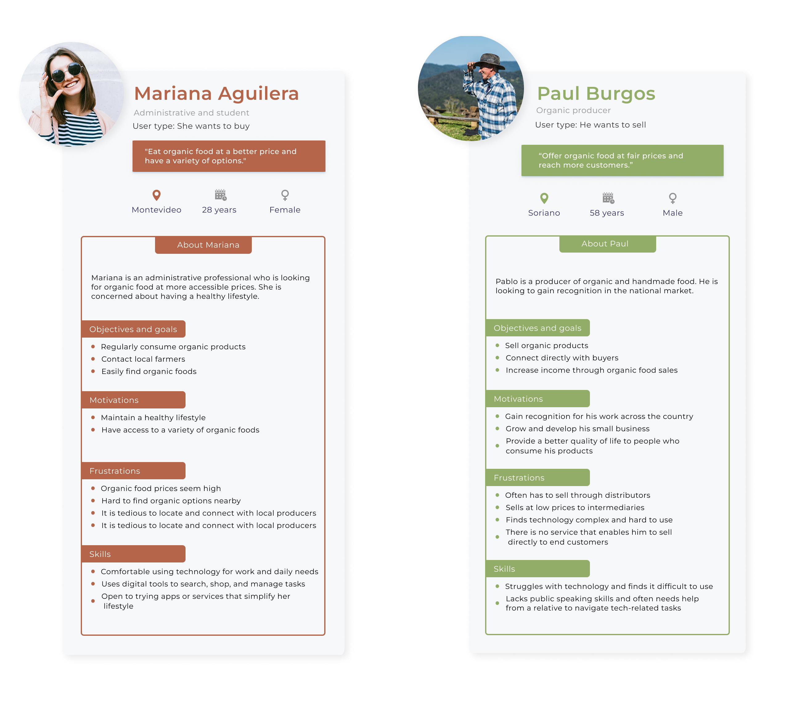
User Personas
Based on the research, two main user types were identified: people (consumers) who want to buy local organic food and producers (local organic farmers) who want to sell their products directly. While both are important, the main focus was on the consumer persona, due to time limitations and course orientation. This is why the core tasks for consumers, like browsing, searching, and purchasing products, were included as part of the MVP to ensure the app was useful from the very first version.
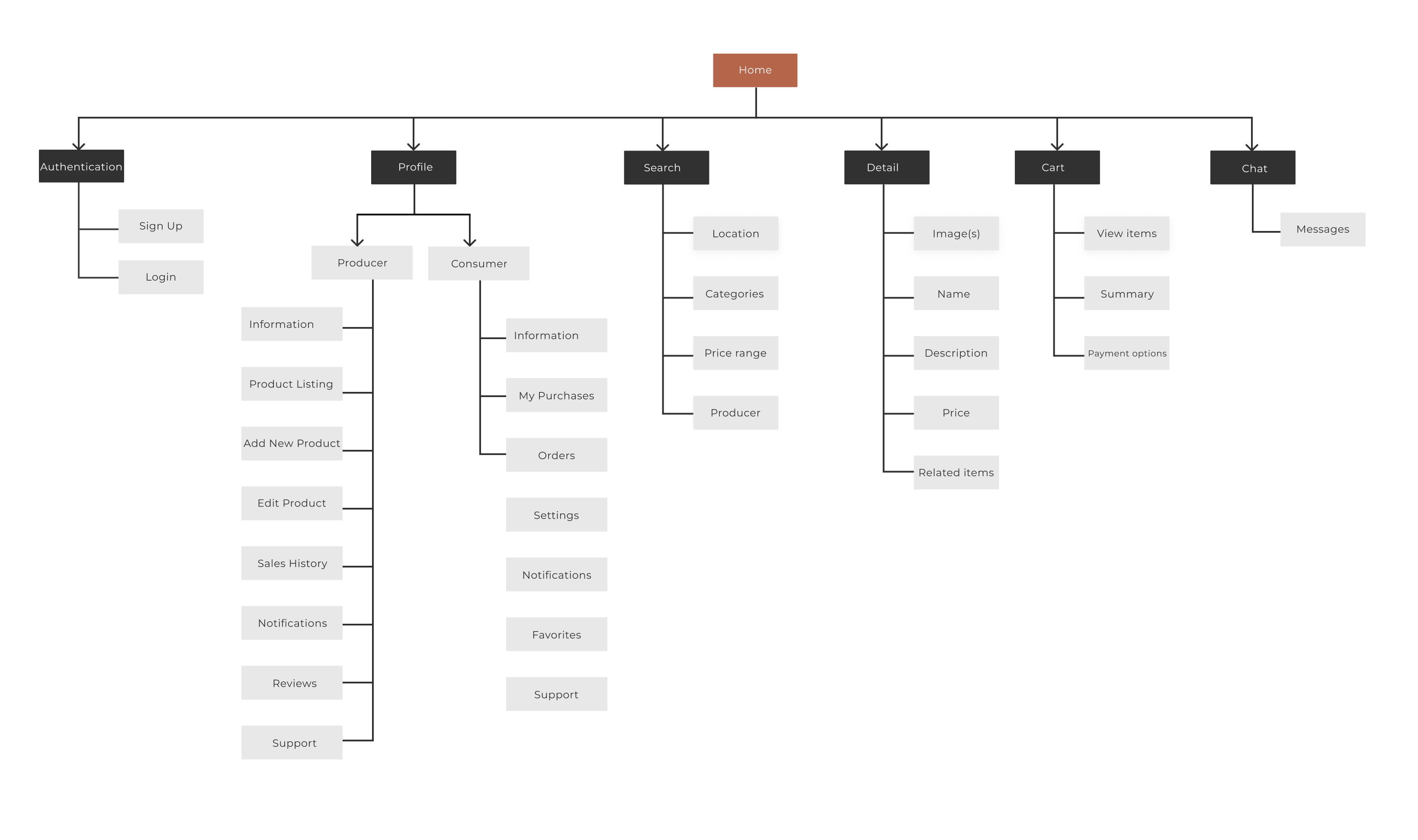
Information Architecture
Goal: Help users (shoppers and producers) easily find, post, and buy local organic products in Uruguay.
The app was organized in a clear and simple way so that both shoppers and producers could use it easily. Each part was planned based on what users need to do, like searching for products, posting items, chatting, or making a purchase. Since the project had a short timeline, it was also important to keep the structure simple and focused. This allowed us to work on the most important features without adding too many extra functions that we wouldn’t have time to fully develop.
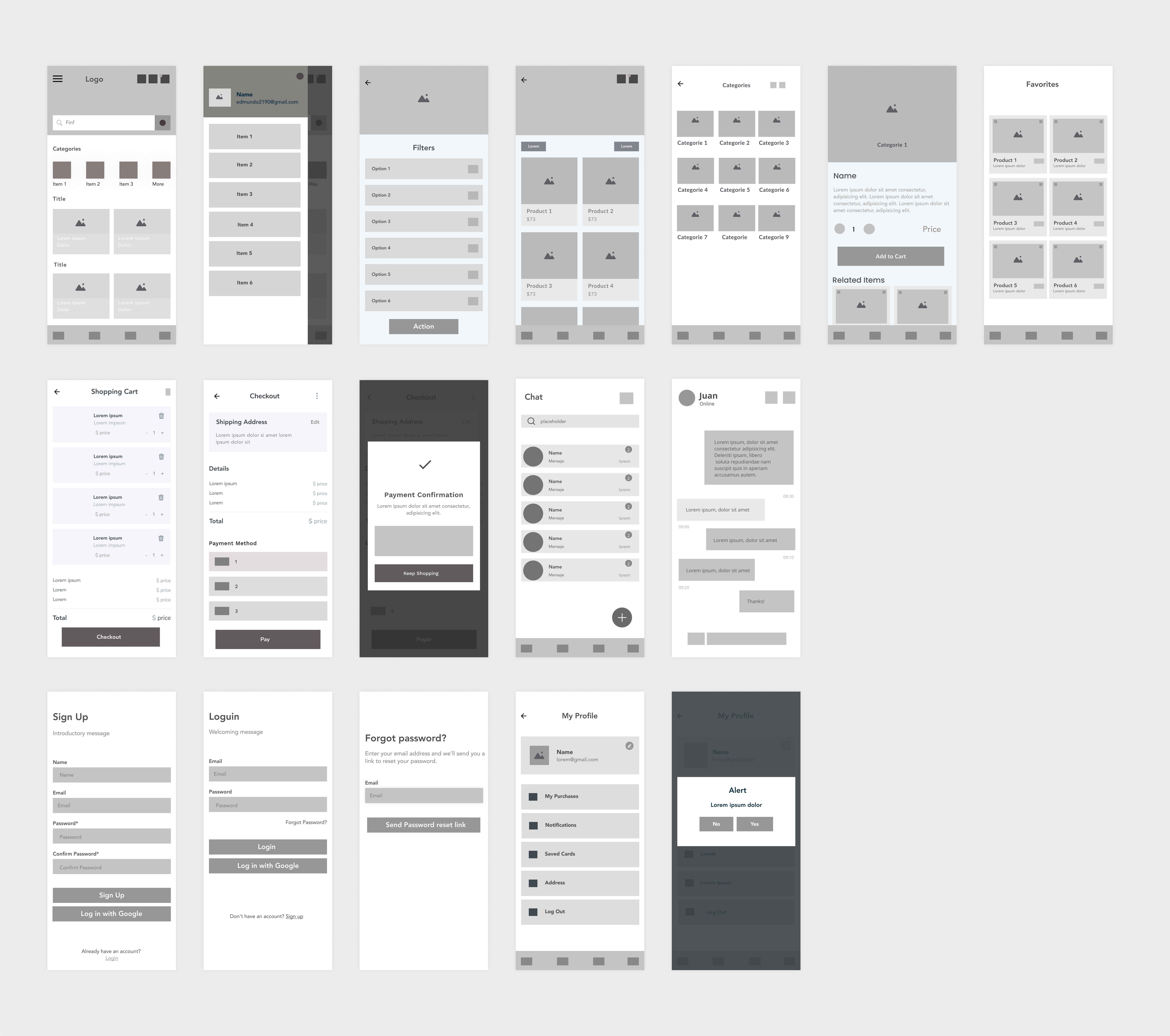
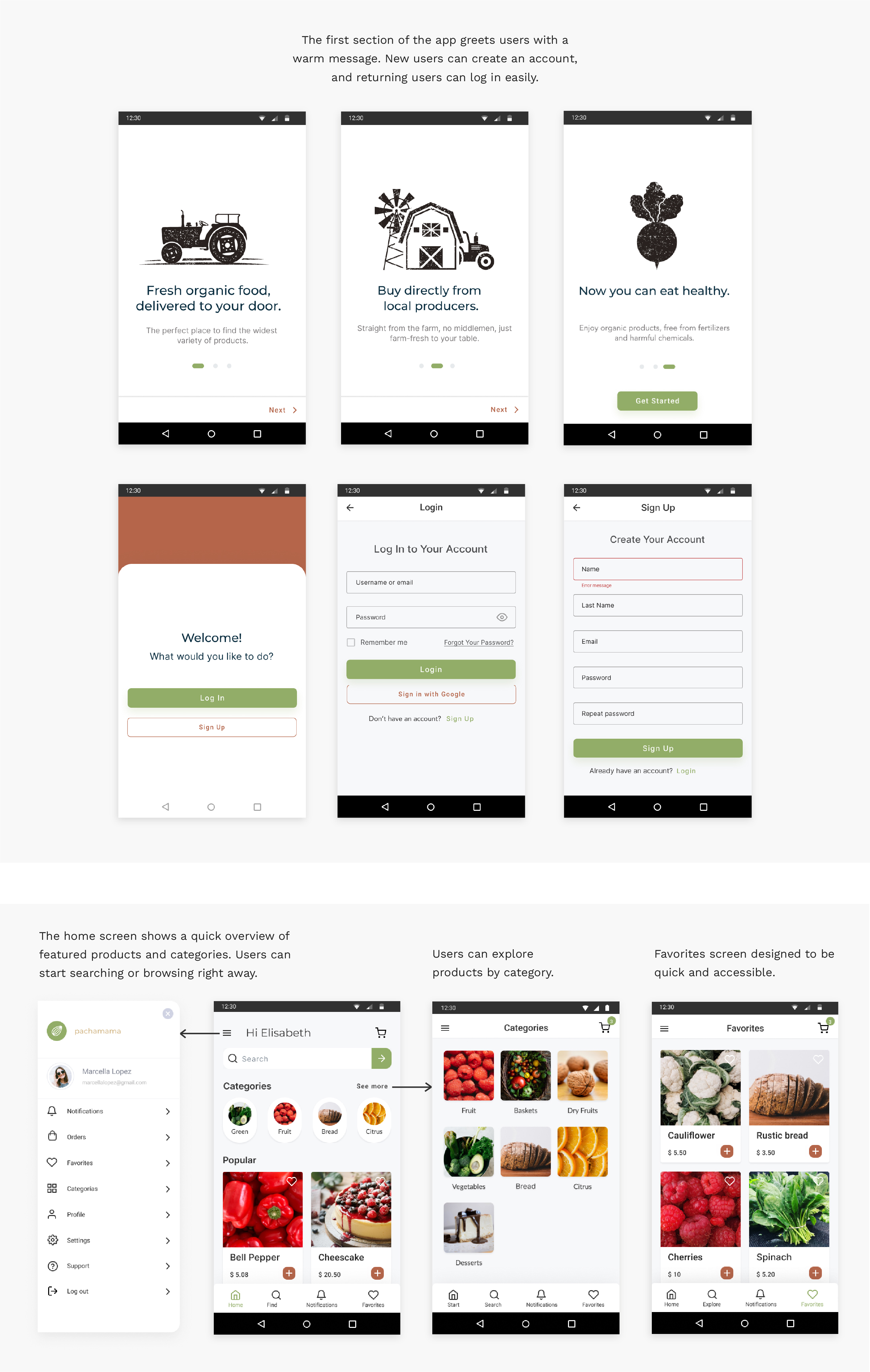
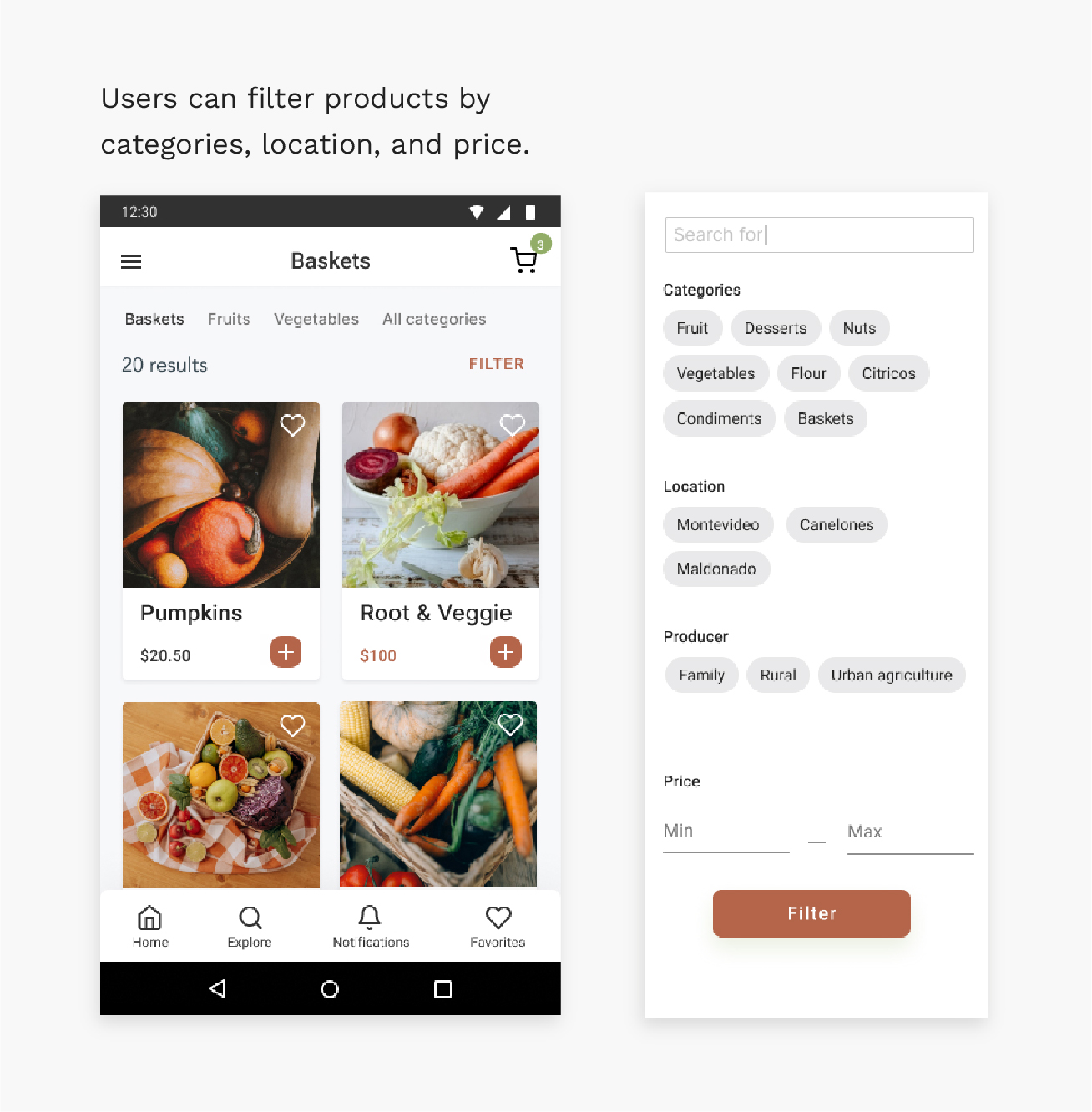
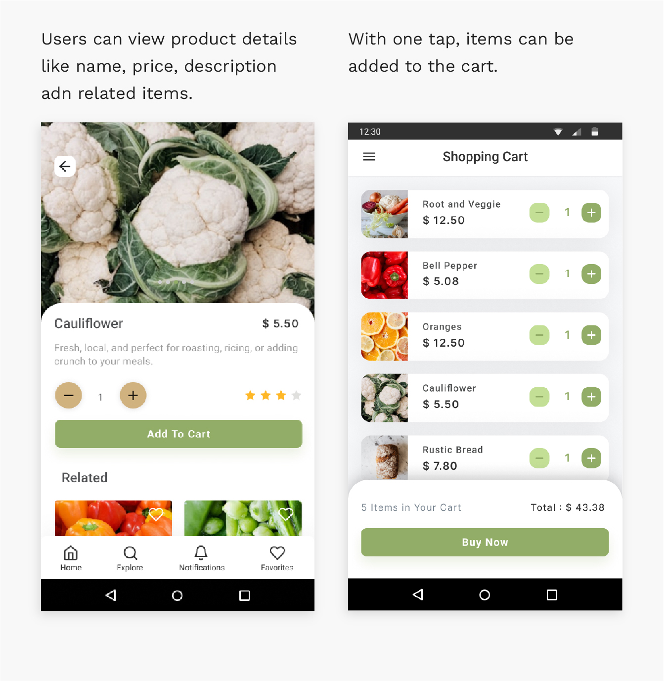
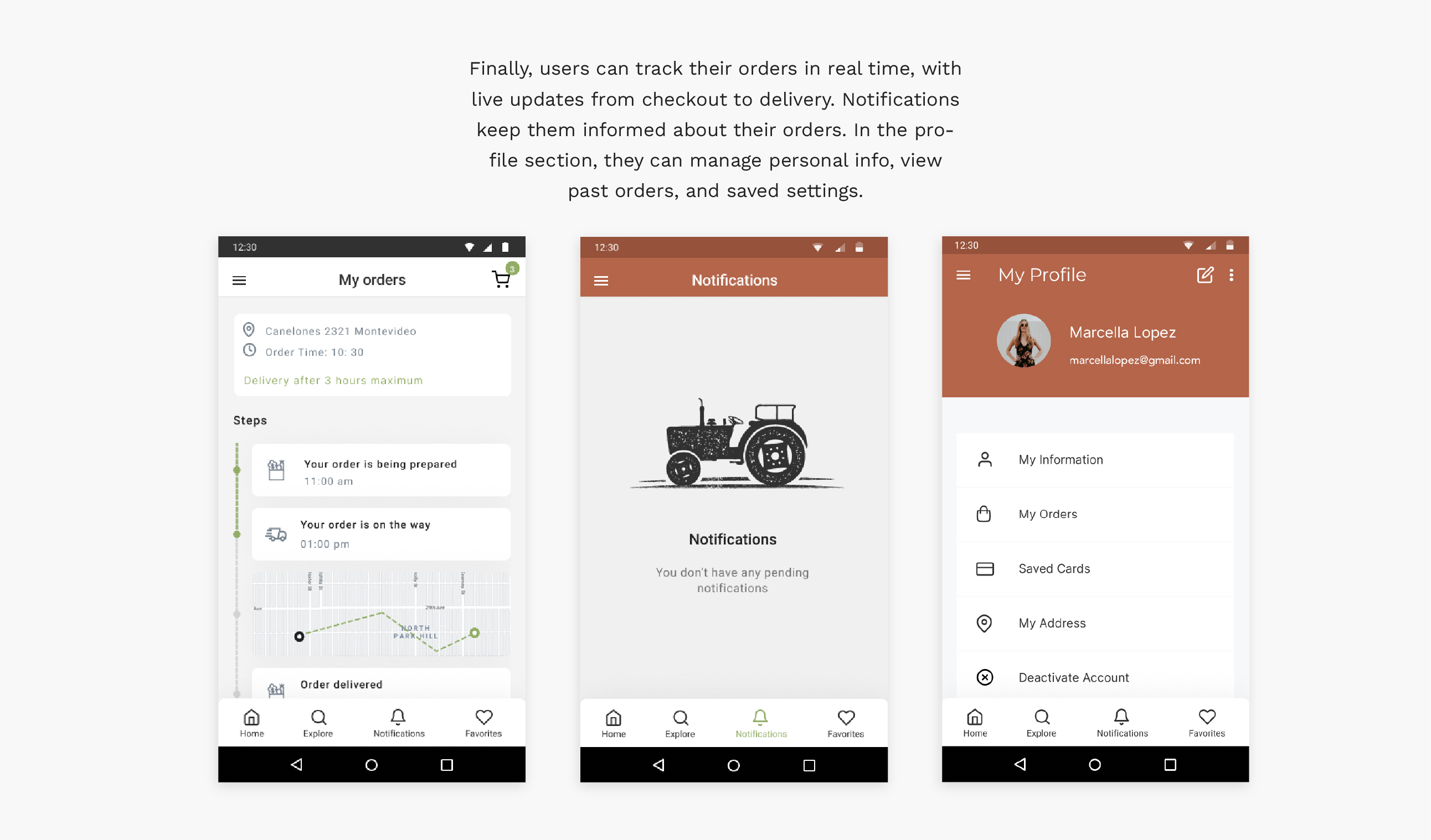
Wireframes
User Flow Simulation & Usability Testing
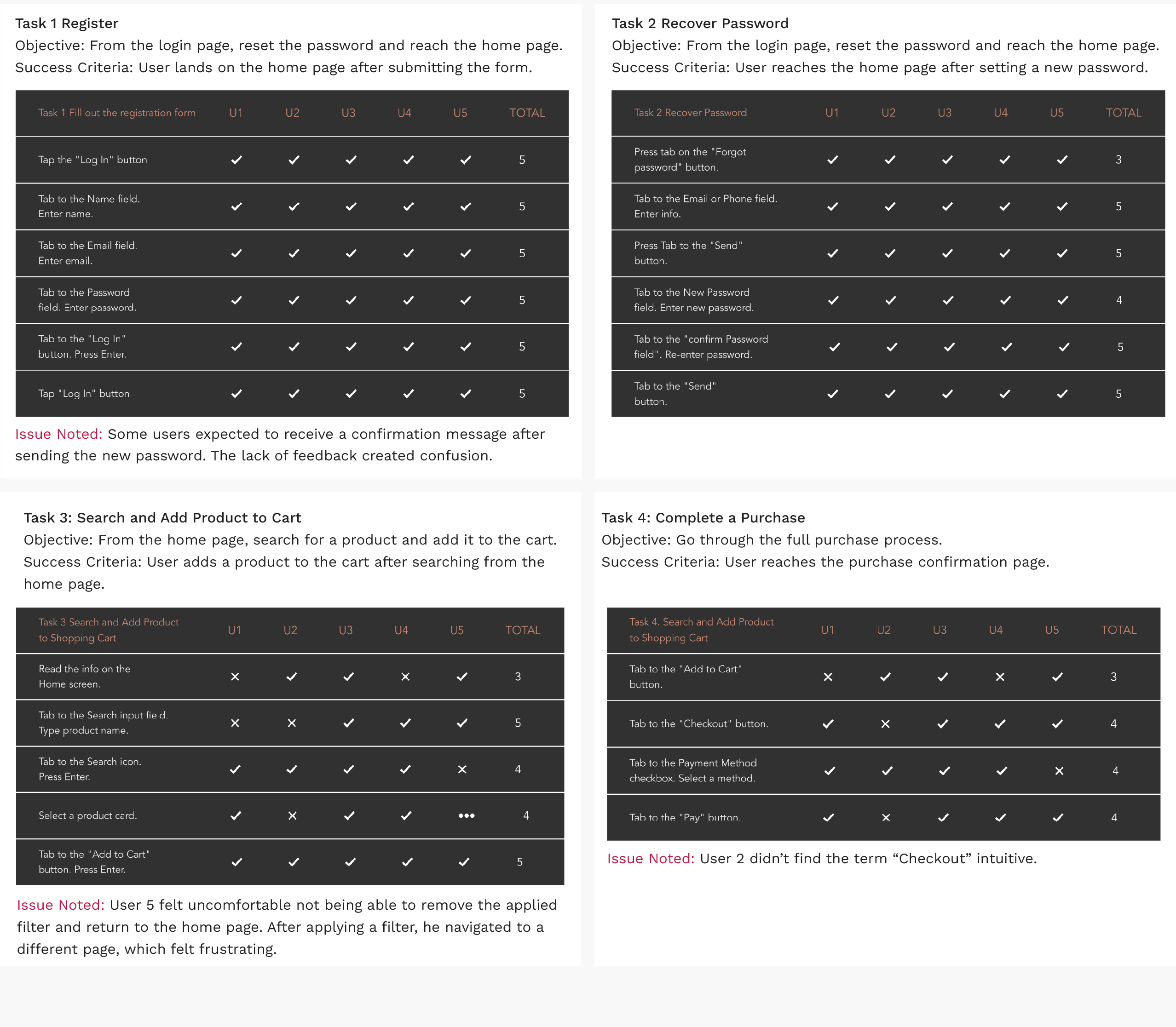
To evaluate how users interact with the app, a hypothetical scenario and five key tasks were created to simulate a typical user journey. These tasks were then tested through informal usability sessions to observe how effectively users could complete them.
Scenario
A person discovers Pachamama through an online ad promoting local organic products. Curious to learn more, they tap on the “More Information” button and are directed to the app’s welcome screen.
- Register and log in. The user signs up and logs in to start shopping for organic products.
- Recover password. The user forgets their password and completes the recovery process to access their account.
- Search and add to cart. From the home screen, the user searches for a product and adds it to shopping cart.
- Complete purchase. The user views their cart and completes the purchase.
- Chat with producer. The user opens the chat to send a message to the seller.
Metrics, Efficiency and Effectiveness
Usability Testing Summary and Key Improvements
Usability testing revealed critical insights that will help improve the app’s user experience. Key Areas for Improvement:
- Navigation flow: Users struggled to return to previous screens, especially during checkout. Improving back navigation is a priority to prevent frustration and ensure smooth task completion.
- Search functionality: Activating the search only via the keyboard was not intuitive for some users. This interaction should be redesigned for better clarity and ease of use.
- Visual clarity: Some text and button designs confused users or lacked readability. Visual hierarchy, font sizes, and contrast need to be reviewed.
What Went Well
- All users successfully completed the assigned tasks.
- Users found the app helpful and easy to use overall.
Usability Metrics
- Effectiveness: High. All users completed their tasks.
- Efficiency: Moderate. Navigation issues and some unclear UI elements slowed users down.
- Satisfaction: High. Users described the experience as simple and the solution as valuable.
High Fidelity Prototype
Impact and Next Steps
This project focused on the buyer experience, helping users connect directly with local organic producers in a simple and friendly way. The app has the potential to grow—future steps could include designing features for sellers to manage their products and orders.
As my first UX/UI project, this was a great learning experience. I applied user-centered design principles, built a full prototype, and tested it to improve both usability and clarity. There’s room to grow, but it’s a strong foundation to build on.